
Last year Twitter fans were faced with a brand new algorithmic timeline followed by a redesigned reply system in March 2017. Just 3 months later; Twitter have presented us with a full redesign of the platform; including new menus, circular profile pictures, new fonts and bolder headlines.
However, this isn’t all; and we think it’s fair to say the nations response has been extremely varied! So, what else has Twitter brought to its redesign?
Solid grey icons have changed to a light grey outline followed by solid grey font also changing to a light grey colour. Headers are now shown in bold. This is to make navigating around the platform easier. Twitter is renowned for its live updates, news articles and occasions and so the redesign has upped Twitters live game by making retweets and like counters update in real time, allowing a live update of which tweets go viral.

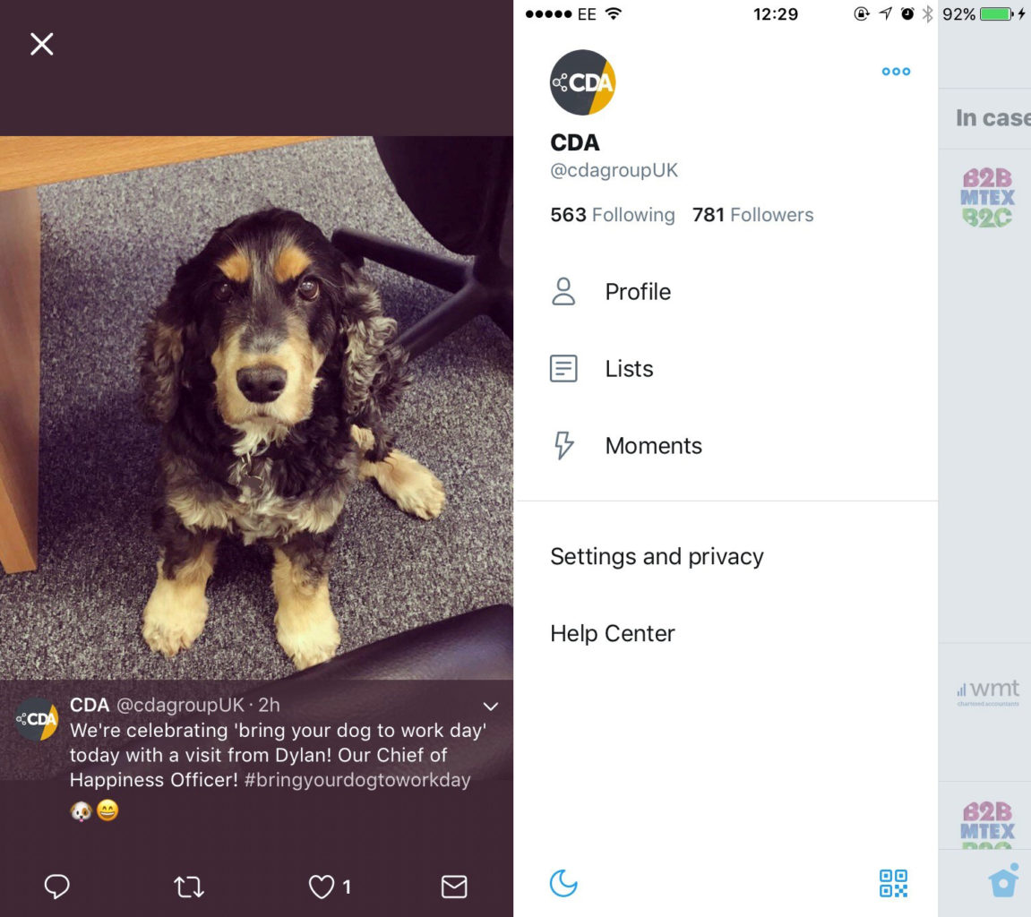
Now, when tweets including photographs are opened they appear in a full screen view and includes the tweet itself as well as the picture. Whereas, before, only the photograph was shown. The profile, additional accounts, privacy and settings tab are now all available in one place; the side navigation menu is accessible by swiping right at the left-hand side of the screen.
Do you prefer using Safari to view external web pages you’ve accessed through Twitter? Users will now be navigated to a version of Safari when clicking on a web link; as appose to Twitters own web viewer.
New icons
New Twitter icons; the arrow which used to represent being able to reply to a tweet has been replaced for a speech bubble. This design is familiar to social media users as Facebook and Instagram use the same icon to create a reply. To eliminate any confusion, it is believed Twitter has made this alteration to make it clearer to inexperienced users that this symbol allows you to create a reply.
Twitter is recognised for its unique birdhouse icon which essentially, resembles the birds home. Suitably used to access your homepage, the simple yet effective icon has also been adjusted; the icon now has one hole instead of two and the perch has been removed – is Twitter perhaps steering away from associating the icon with the bird?
However not of Twitters icons have undergone a redesign. The search, notifications, retweet and like (shown as a heart) have just had a simple refresh!
![]()
Night mode
Introducing night mode! Twitter have recently created confusion amongst users by automatically changing their feed to night mode colours. This gives a more comfortable experience in the evenings. This is an automatic change when Twitter is used after the app has been updated. This can be switched off by clicking on the moon icon at the bottom left of the navigation menu.

Twitters redesign hasn’t been loved by everyone with the social media channel receiving negative feedback through memes, GIFs and tweets expressing their frustration. Get in touch to tell us your views on Twitters big redesign and what you would like to see return from the previous version.