Pre-Fabricated Healthcare Hubs for Communities


THE BRIEF
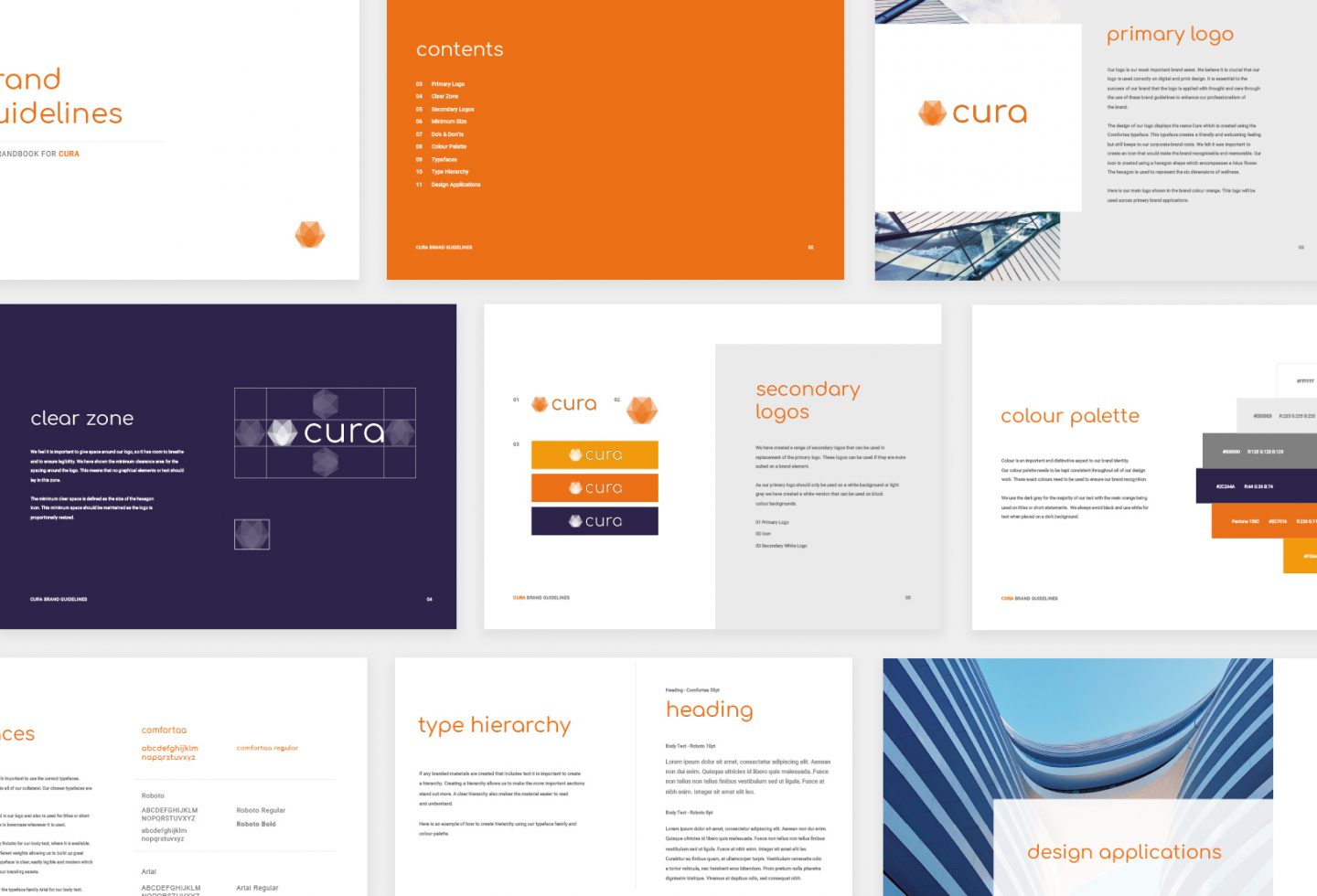
Willmott Dixon approached us with a new venture they were preparing to launch in the UK which aimed at revolutionising the healthcare construction industry. They had a placeholder name and logo which they weren’t entirely happy with; so asked us to come up with some new ideas. We agreed that a full branding project was required; starting with research for a new company name all the way through to brand guidelines and assets, as well as a showcase website to launch with.
OUR APPROACH
After researching and holding several workshops with key stakeholders; we agreed on the name ‘Cura’, which represents the personification of health & wellbeing in Roman mythology. Once the brand and logo were agreed; we conceptualised and developed the brand assets and website in time for Willmott Dixon to debut Cura at an upcoming healthcare exhibition.
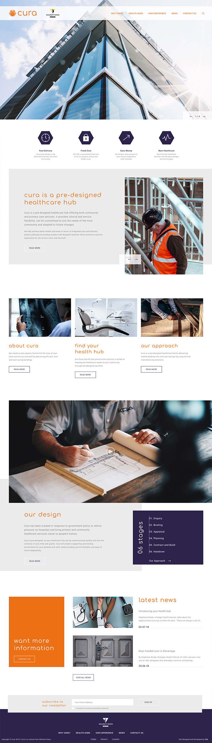
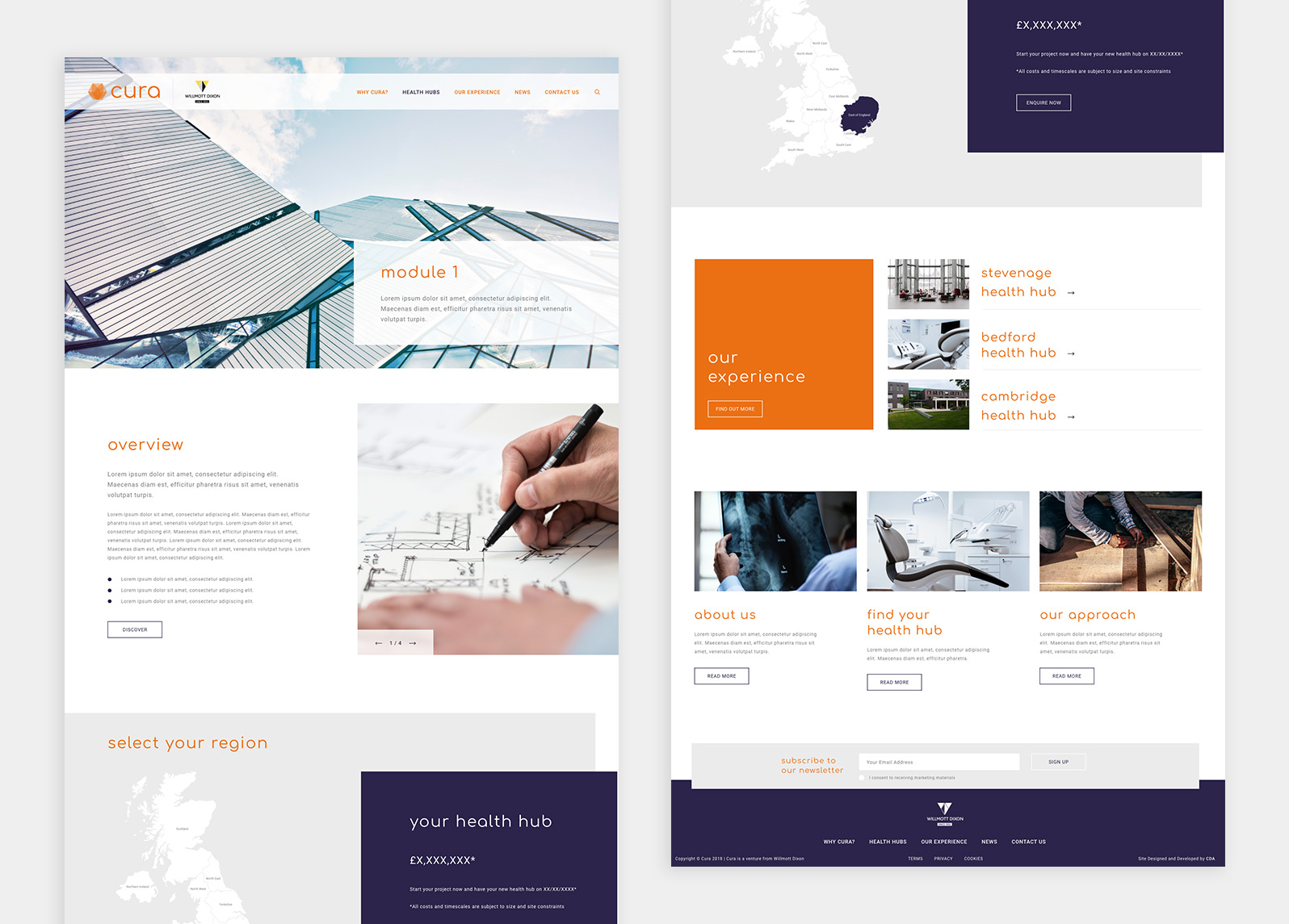
The Website
Reflecting the brand colours of orange and navy which symbolise warmth, trust and control; the Cura website is a fresh, image led site which acts as a lead generation and validation tool for prospective clients.