
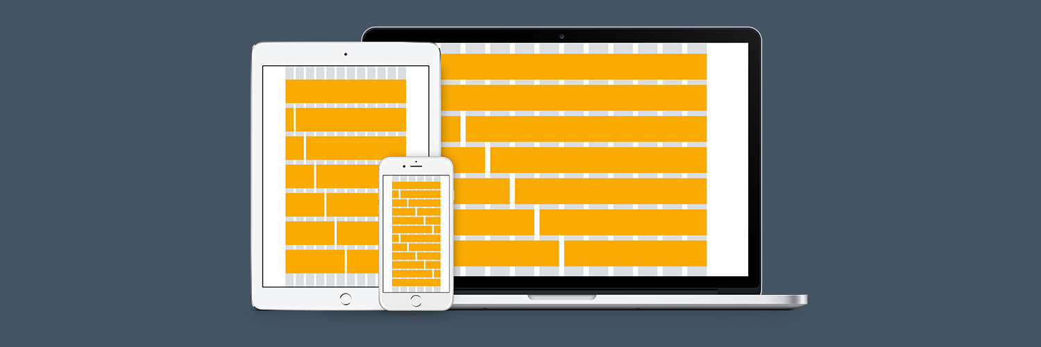
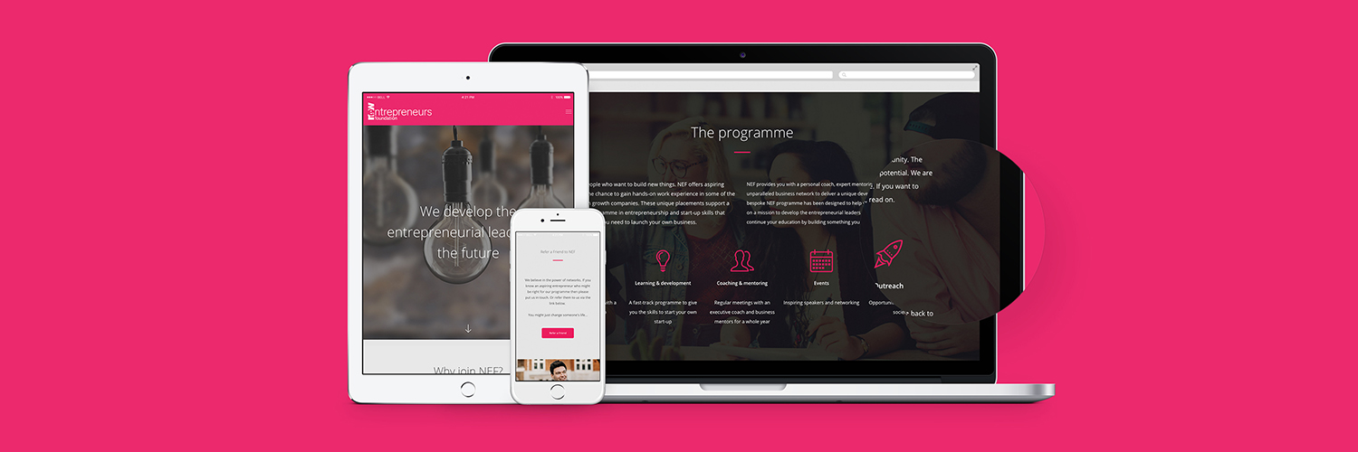
Having a website with responsive design means that it can be adapted to any screen, whether that is mobile or desktop. It refers to the way in which a website automatically fits to the screen which gives the users the best experience they can have.
Why is responsive design worth investing in?
Nowadays, everything we do takes place across multiple screens. This means that your site needs to do the same, so that users can view your content across different devices.
It’s important for you to appeal to both desktop users and those using mobile devices. It isn’t surprising that nowadays mobile users outweigh those using desktops, and it’s inevitable that this number will rise with the accessibility of smartphones.
Having one website means only having to update your content once
Keeping a website updated and fresh when it comes to engaging content is often difficult; but imagine having to do this across more than one website; keeping the branding and messaging on point so that it appeals to users across multiple devices; you can see how much extra work would be involved.
This is one of the many reasons why a responsive design for your website is important. This means users are sent to either a desktop or mobile-friendly version of your website and it will work just as well.
You will see an improvement in search engine rankings
Google has long recommended websites that make use of responsive design. In recent years, the search engine started to add identification for mobile-friendly websites. This is so that sites would show up on search results conducted on mobile devices.
In 2015, Google started offering rewards for websites that utilised responsive design; which effectively shunned those websites that didn’t make use of the feature for their own websites; meaning that responsive design became vital for SEO.
Responsive design allows for future progression
By choosing to use a responsive website, you have a better opportunity when it comes to supporting newer screens and devices. Websites that are responsive are fluid can be scaled up or down depending on the screen size used to access the site.
Newer devices that reach the market will have varying screen sizes, perhaps some unlike any we have seen previously, so a website that uses responsive design will be able to maintain its purpose and give users the experience they need when viewing your site, regardless of their screen size.