Colour can be tricky, especially when it comes to effective marketing and design. A branding agency may use colours to invokes specific feelings and associations with a brand, and consistency in all forms of branding – be that on the website, social media, traditional print, visual merchandising or a product itself – is vital
One person’s turquoise can be a light blue to another, or perhaps even a soft green. Navy blue can encompass a broad spectrum of shades. But the Pantone system allows designers to specify this exact shade of hot pink, burnt orange or olive green, and know that whatever the medium and whoever they’re talking to, that’s the colour they’ll get.
What is the Pantone system?
Pantone provides a universal language of colour that enables brands, manufacturers and designers to make critical decisions about colour with absolute precision and certainty that everyone is on the same page. Using the Pantone system means that communication and design can be clear and consistent across various materials and finishes for graphics, fashion and product design. Swatches, sheets and chips help professionals identify and choose the colours they want to use, and the system ensures that they always know precisely which colour they are discussing or using.
It is not the only colour system out there, but it is the most widely known and used one.
How is it used?
Within digital marketing and website design, Pantone guides and Pantone Connect provide designers with every colour they could imagine, in swatches and palettes for aesthetically pleasing and accurate design.
Simply put, the Pantone Matching System provides a unique code to over 2000 colours. When you are talking about the colour red as found in the Google logo, you are talking specifically about Pantone 7619 C.
The Pantone Color Institute and Colour of the Year
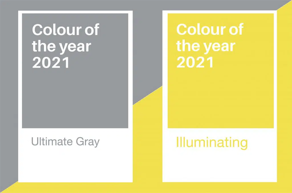
The Pantone Color Institute was founded in 1986 to guide brands and designers on the use of colour using their expertise. From this Institute, every year a group of experts search the world for the latest and most important colour influences, and pick a Pantone Colour of the Year. The Colour of the Year 2021 may look like yellow and grey to the untrained eye, but is in fact PANTONE 17-5104 Ultimate Gray + PANTONE 13-0647 Illuminating. These two colours express the mood by representing different elements coming together in support, being both practical and optimistic, and highlighting strength and positivity. Expect to see this colour combination trending across the design world!

If you have a vision of a colourful, bold website, get in touch to discover how we can bring our responsive design expertise to the table!

